Cemesa
Website • UX/UI Design • User research
Background
CEMESA’s team wanted to offer information more efficiently to clients. Originally, they offered information to clients on the phone.
Goal
The primary objective was to minimize incoming phone calls to the center, all while ensuring users remained well-informed.
Role
The role involved working as UX/UI designer and researcher. I took care of all stages of the project, from empathising to testing.
Methods
Design thinking, competitors analysis, interviews, prototyping, usability testing, and card sorting.
The process
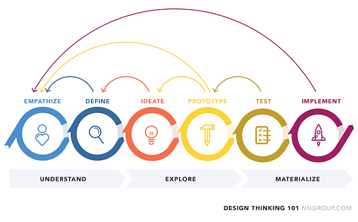
For this project, I followed the design thinking approach, emphasizing a human-centered perspective. This iterative process enabled me to empathize with users, define problems, generate innovative ideas, prototype solutions, and iterate based on feedback.
Initial research
The starting point of this research was the data that the center had collected through the years and the current situation. The covid pandemic had started and clients could not come and wait in the waiting room anymore as it was getting too crowded for it to be safe. It was also mandatory by law to give appointments to clients so no more than 2 would be inside the clinic at the same time.
The clinic started to give appointments on the phone and in person, but the system was time consuming and had no proper tracking. Clients had to remember the appointment and there was no way for them to cancel the appointment or change it without calling or visiting the clinic.
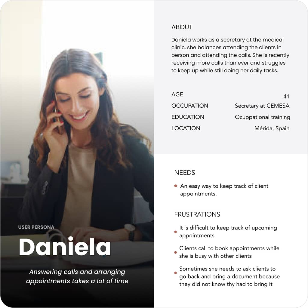
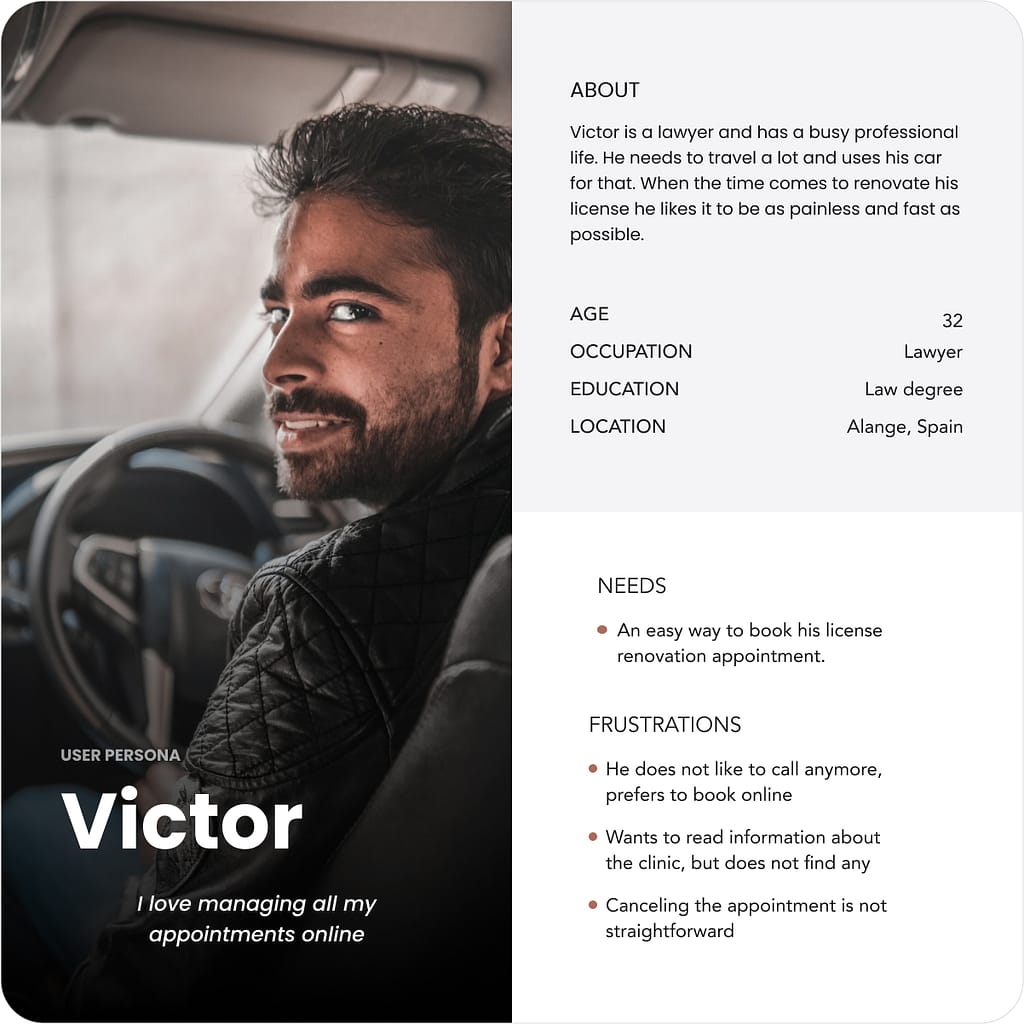
Personas
Competitors analysis
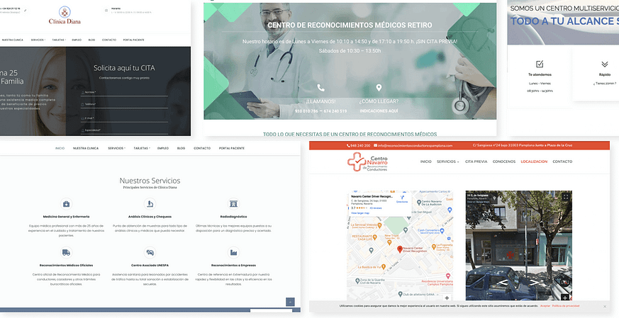
To gain a deeper understanding of how other centers were organizing their websites, I analysed the websites of local competitors. I focused on website structure, design, and user experience, menu structures, content categorization, visuals, and interactive features. This analysis was a valuable exercise in identifying effective common patterns and innovative practices that could help in creating a competitive website.
Information architecture
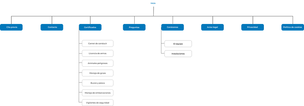
To create the site map, I ran a card sorting test with participants that fitted in the target user base. From the categories created by participants and the user goals, the site map took its form.
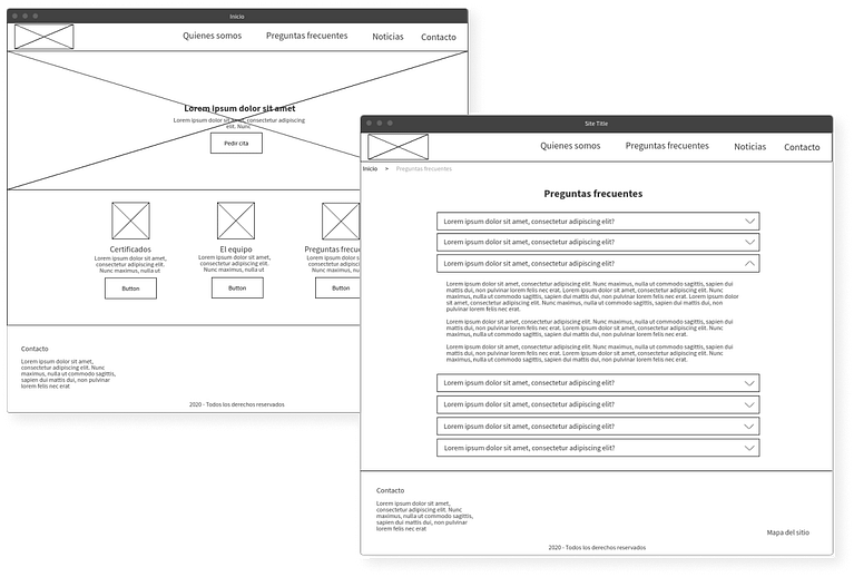
Wireframes
Once the information architecture was done, I created the first mockups in paper. Afterwards, I put them into low-fi wireframes. This way I could focus on the structure, layout, and functionality, without getting into the specifics of visual design elements.
Usability testing
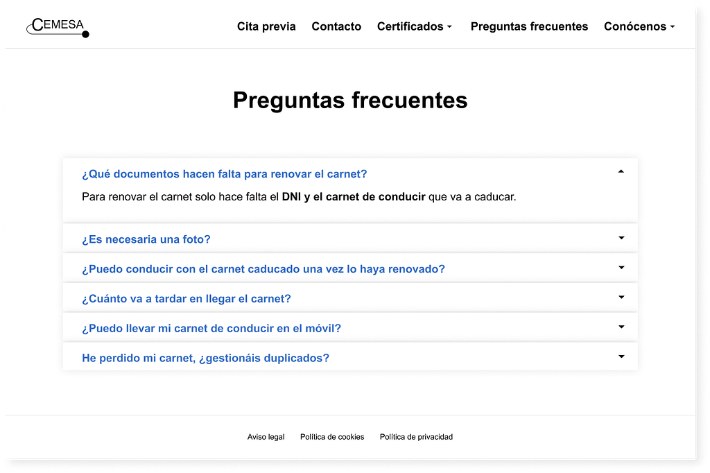
I planned and conducted a remote, moderated usability test with 6 users where I measured task success, time on task and SUS. After it, I analyzed the feedback and made improvements to the website.
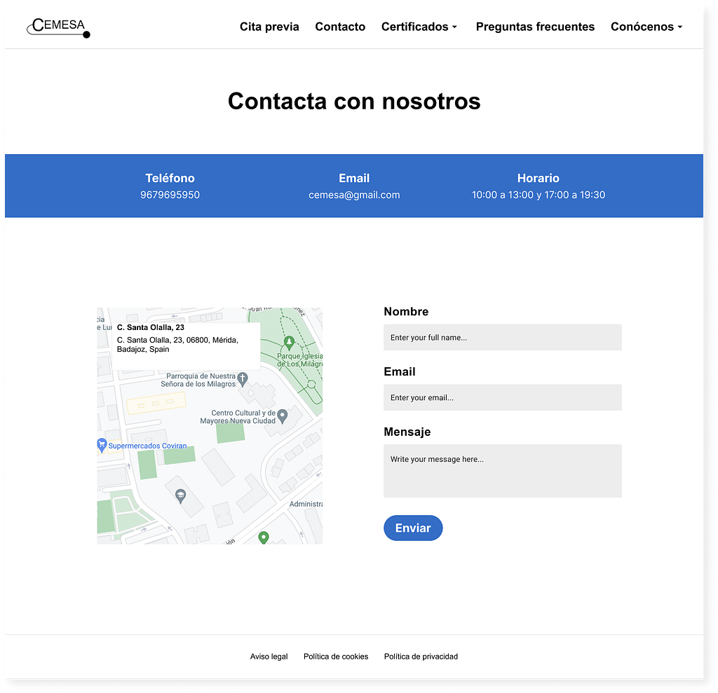
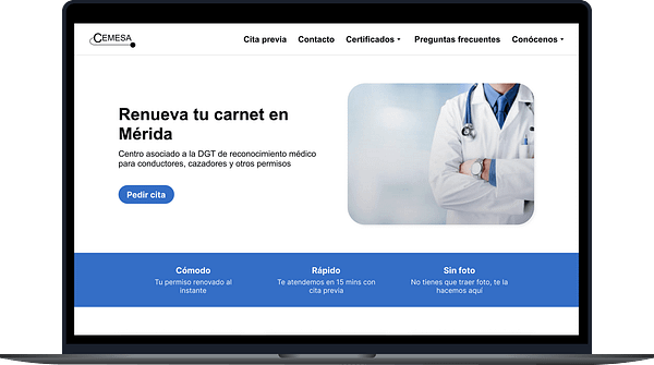
One of the main learnings was that users wanted to see the opening hours before booking an appointment or contacting the center. I added this information on the home page and contact page.
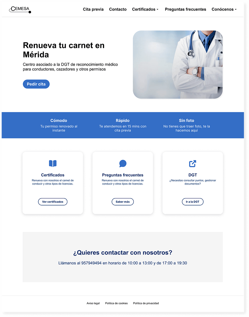
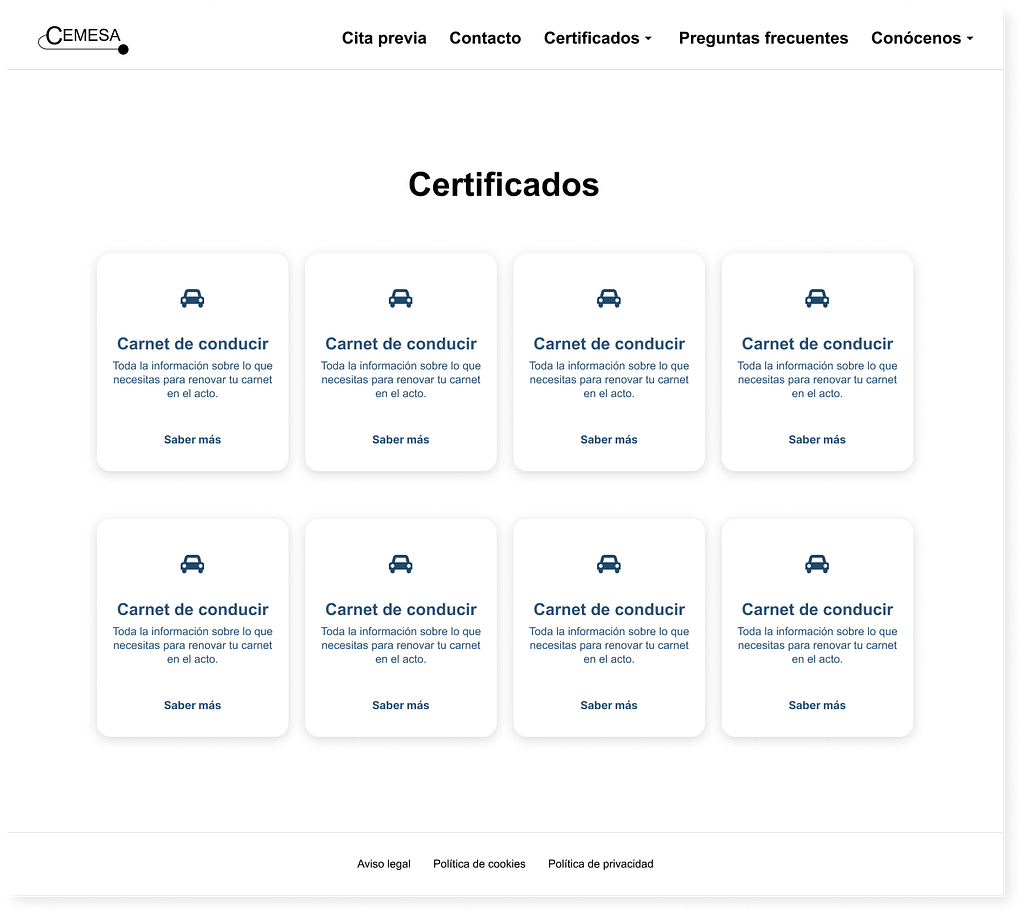
Final design
Color palette
To ensure the accessibility of the website and optimal readability for all users, I created a highly accessible color palette.
The primary objective was to establish a color scheme that would provide adequate color contrast, catering to individuals with diverse visual abilities.

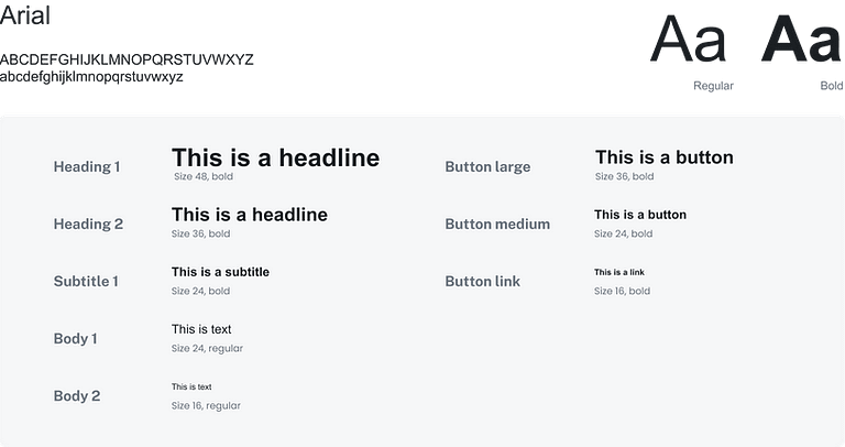
Typography